
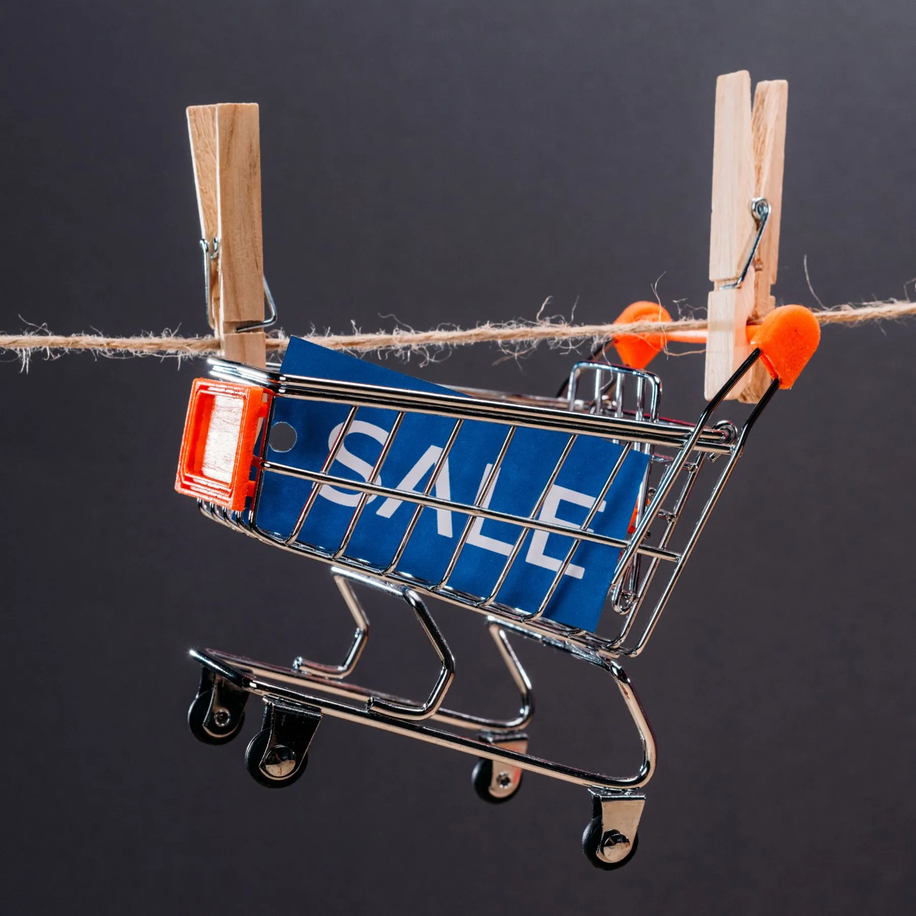
Information architecture consists of building the structure of content, organizing it, labeling it appropriately and placing it in an adequate context. As UX designers, we pay special attention to it and during UX audits We spend a lot of time analyzing it. This is a key aspect that determines the usability of the website and whether the user will find content or products of interest in the store.
When working on AI, the designer focuses primarily on the user and their convenience when exploring the store. Thanks to a properly thought-out architecture, navigation in the store is clear and intuitive, users can easily realize the intended goal. The information architecture concerns not only navigation or the store menu, but also the hierarchy of content, the naming of buttons, the planning of the search system, the creation of links or the planning of the so-called user flow. Based on our experience, we have prepared the 10 most important points that we check during the audit of stores for our Customers.
Consistency
The architecture of the information must be coherent and consistent within the entire service and between versions for individual tools (desktop, mobile, tablet). Menus, search engine, headers are always placed in the same place regardless of the content presented. The mobile version should offer similar capabilities as the desktop version (unless there is a clear justification for introducing differences).
Buttons and links
All buttons used to perform actions important to the user (e.g. adding to cart) are clearly distinguished from other links and buttons (secondary). Buttons, links and other navigation elements point to content that is indicated by their labels or applied markings and the labels are understandable to users (e.g. “Go to cart” rather than “Click here”).
Inactive elements
The elements (buttons, the ability to choose the color or size of the product, the available options, etc.) that are inactive are clearly marked and are distinct from the active elements.
Current information
A notification system has been introduced in the store, which informs the user about the state of the system (loading, data processing) and the actions performed (e.g. adding to the cart or opening machine), thanks to which the user knows what is happening while browsing the store, whether he responds to his actions.
Indication of the place in the store
The user on each subpage can tell where he is currently located. This place is marked, for example, with the title of the subpage and the so-called breadcrumbs.
Navigation
It is visible immediately after entering the store. Categories are readable and understandable for users, they can be distinguished from each other. Categories after expansion (the so-called second-level navigation) are noticeable to users, they can easily find them and familiarize themselves with the names of subcategories. In the case of stores with several products in the offer, they are not grouped in categories, but listed in the navigation so that the user can quickly find them. It is important that there is no category without products in the store.
Categories
In the case of a category with a large number of products, it has been divided into subcategories to make it easier to search the content. The classification of categories must be understandable to users, so it is worth avoiding industry jargon (unless it is a specialty store and its users have knowledge of the industry) and incomprehensible icons.
Product Search
Users can navigate to the selected product category in several ways, for example through filters or product categories in the section about promotions or news. Product types are sorted by customer types, such as gender or age. In similar product categories or on the product card, the user should be able to check similar products.
Readability
The store does not have an overwhelming number of categories in which it can be difficult for the user to find the product they are looking for. The main categories are highlighted, products in promotion and novelties are also distinguished.
Mechanisms in navigation
For categories that do not have subcategories, there is no dropdown mechanism or an icon indicating the possibility of expanding the category. After clicking on its name, the user is immediately transferred to the list of products. On the other hand, categories that have an expanded list of subcategories work when you hover or click on the name and have the appropriate mechanism to collapse it, such as when you scroll down the list or click on the name again. If subcategories are visible when hovering, their list is large enough that the user does not close it by inadvertently moving the cursor.
We always advise customers to ensure that the information architecture of their store is well worked out. It is worth spending the right amount of time planning content, developing hierarchies, user flow, and all aspects related to AI. Otherwise, if there are errors in the information architecture of the store, the user will quickly become discouraged, will not find the product he needs and will finally give up shopping. This is a key area at the time of website design, which has a great impact on its usability.


